We've got the ocean, got the babes
Got the sun, we've got the waves
--Best Coast, "The Only Place"
We've got the ocean, got the babes
Got the sun, we've got the waves
--Best Coast, "The Only Place"
I now sit perched atop my hill in Marin County, California sporting a tee shirt staring at 150 year old palm trees and listening to the hummingbirds buzz not 5 feet from the milk crate on which I sit.
I write long-hand, my preference as a professional cursive-maker, unable to shackle myself to my large desktop inside; my drafting table a forgotten mess.
In Portland, February would be a most productive time. Unable to venture out, all one can do is stay warm and create.
Yet I persevere in my new sun-drenched existence. I must not allow the sun temptress to flirt with me, cajoling me to play with her.
Custom Ketubah commissions await; projects in various stages of development must be completed and sent out to their respective clients. Etsy orders need to be filled.
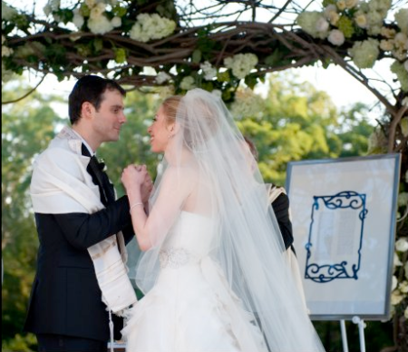
Thus I bring the flora and fauna of my new land to the Art Nouveau Leaf and Vine Ketubah I created recently for a wedding in Lake Tahoe. Forging a new identity in a new land.